Practicing CSS


[What to practice]
<h1, h5, background-image, background-size, background-position
color, width, height, border-radius, margin, paddling>
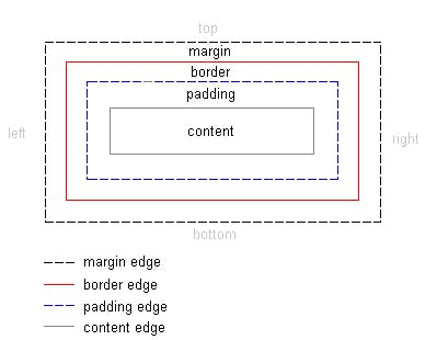
If you see a box such as below: it is <div>, division or section

For this image...

<Padding>
Clockwise) padding-top padding-right padding-bottom padding-left
<!DOCTYPE html>
<html lang="en">
<head>
    <meta charset="UTF-8">
    <meta http-equiv="X-UA-Compatible" content="IE=edge">
    <meta name="viewport" content="width=device-width, initial-scale=1.0">
    <title>Document</title>
    <style>
        .mytitle {
            background-color: green;

            width: 300px;
            height: 200px;

            border-radius: 10px;
            color: white;
            text-align: center;

            padding-top: 30px;

            background-image: url('https://www.ancient-origins.net/sites/default/files/field/image/Agesilaus-II-cover.jpg');
            background-position: center;
            background-size: cover;

        }
    </style>
</head>
<body>
    <div class="mytitle">
        <h1>Log-In Page</h1>
        <h5>Type ID and Password.</h5>
    </div>
    <p>ID : <input type="text" /></p>
    <p>PW : <input type="text" /></p>
    <button>LOG-IN</button>
</body>
</html>
For the image, three lines!
background-image:
background-position:
background-size: always stick together...
<div class = "wrap"> for margins on each side

   <style>
        .mytitle {

            width: 300px;
            height: 200px;

            color: white;
            text-align: center;

            background-image: url("https://www.ancient-origins.net/sites/default/files/field/image/Agesilaus-II-cover.jpg");
            background-size: cover;
            background-position: center;
            border-radius: 10px;
            padding-top: 40px;
        }
        .wrap {

            width: 300px;
            margin:auto;
        }

    </style>

</head>
<body>
        <div class = "wrap">